2022
Doctors’ Dashboard
Web desktop, full research-to-design project
Project overview
About
The Doctors’ Dashboard is an internal portal for doctors to consult patients online, document medical findings, prescribe medications, and all things needed to deliver online consultations effectively.
Timeline
4 months
My roles
User research execution and reporting
Information architecture and user flows
UI design iteration
Interaction design
Telemedicine in Singapore
Telemedicine in Singapore has come a long way since 2017, the beginnings of what many of us are now familiar with—consulting a doctor remotely via video conferencing in the comfort of our homes.
The COVID-19 pandemic rapidly accelerated its growth, acceptance and ubiquity, becoming not only popular but a necessity to meet the needs of thousands of patients unable to visit physical clinics.
Today, a single WhiteCoat doctor could see more than 10 patients every hour.
The problem
Behind the seemingly simple interface from which a patient primarily sees their consulting doctor is the complex, information-heavy interface doctors use to conduct tele-consultations – called an electronic medical record (EMR).
Doctors are constantly referring to supplementary medical information, taking notes, forming a diagnosis, prescribing medications, and so on.
The massive increase in patient volume has equally increased cognitive load on doctors to multitask repeatedly from patient to patient while providing the same level of care to patients as they would expect face-to-face.
Project objective
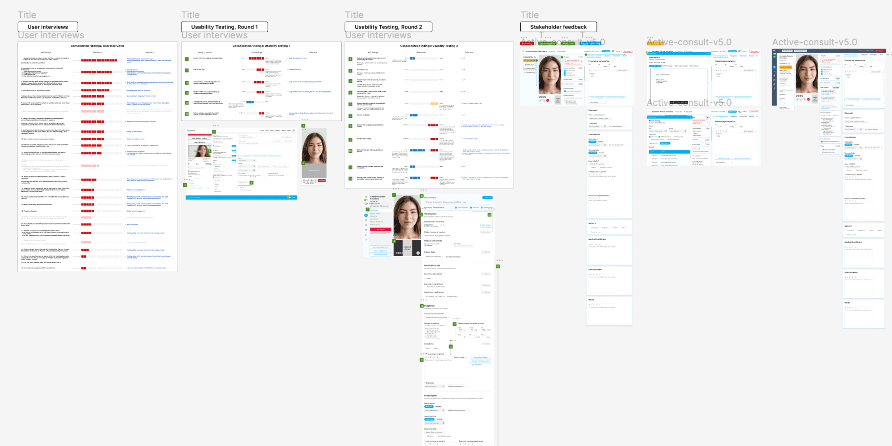
My team set out to identify and improve the key usability issues through primary user research with our internal team of doctors.
At this juncture, we already had a general sentiment from the doctors that the dashboard needed improvement but not the specifics. With this, we dove into primary user research to uncover the specific pain points.
Ultimately, the goal was to improve satisfaction amongst the doctors.
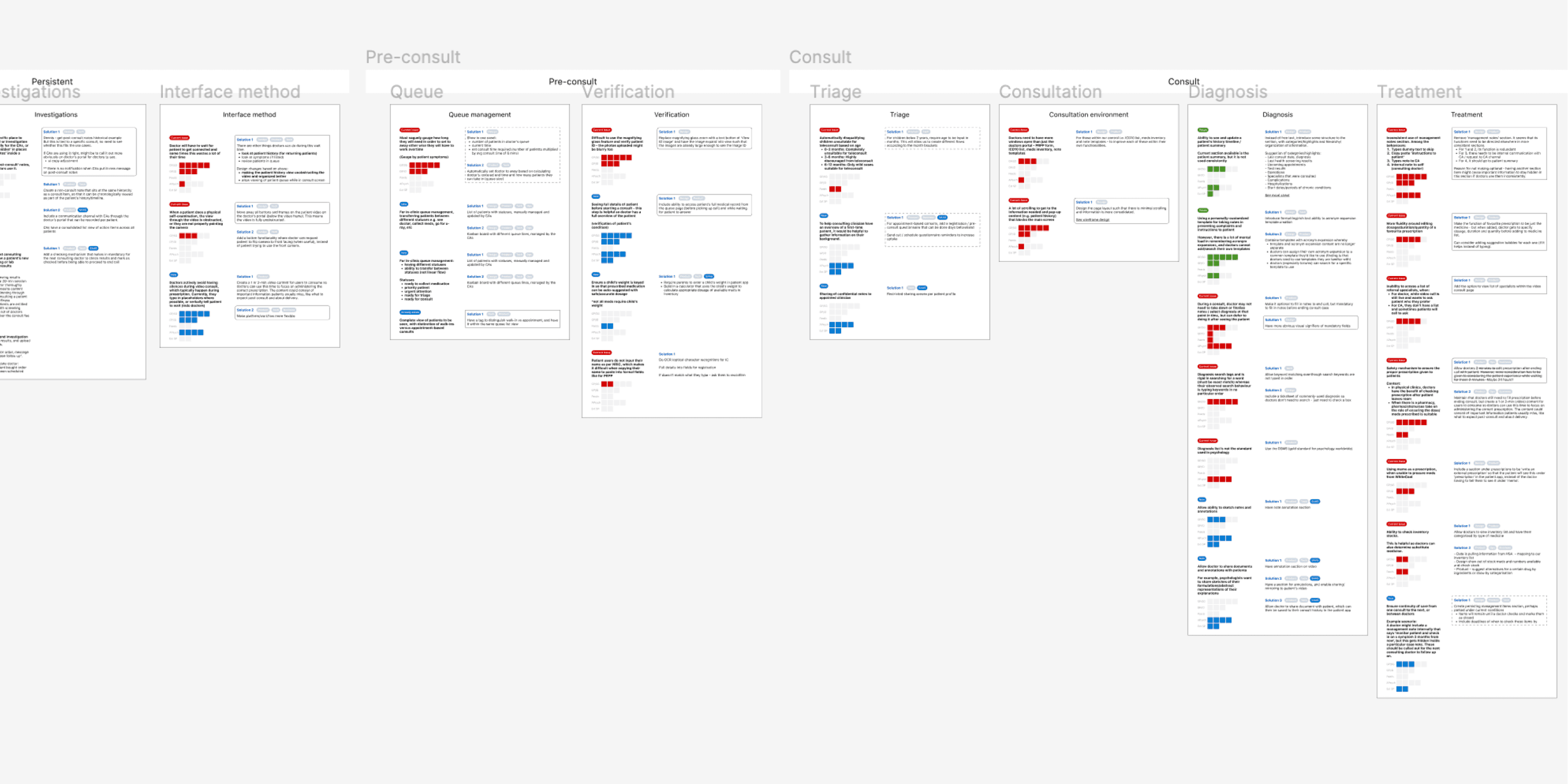
Primary user research & information gathering
To create a strong foundation to tackling this project, we needed to understand all the context behind the dashboard creation. This includes things like reasons behind design decisions, technical constraints, past stakeholder inputs, edge cases, and so on.
We took a parallel approach with the following steps:
Contextual inquiry and user interviews with primary users
Legacy information gathering with the product and development team
Competitive and comparative analysis of other products in the market
And once we had sufficient information, we analysed the patterns and findings in order to prioritise the issues and emergent themes.
Scroll below for details.
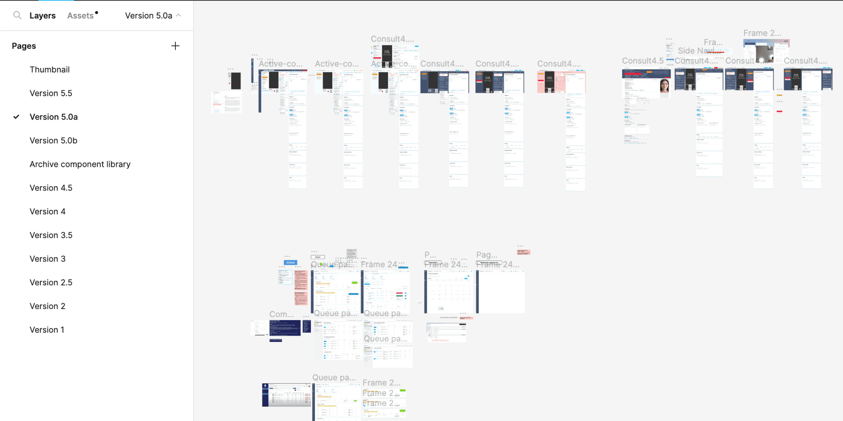
Ideation, iterative design, and usability testing
There were 3 key processes involved with delivering the solution:
Visual and interactive design with rounds of minor and major iterations
Usability testing and analysis with primary users
Collaboration with the development team and business stakeholders
And once the final solution was approved by all stakeholders, the final step before handoff for development was:
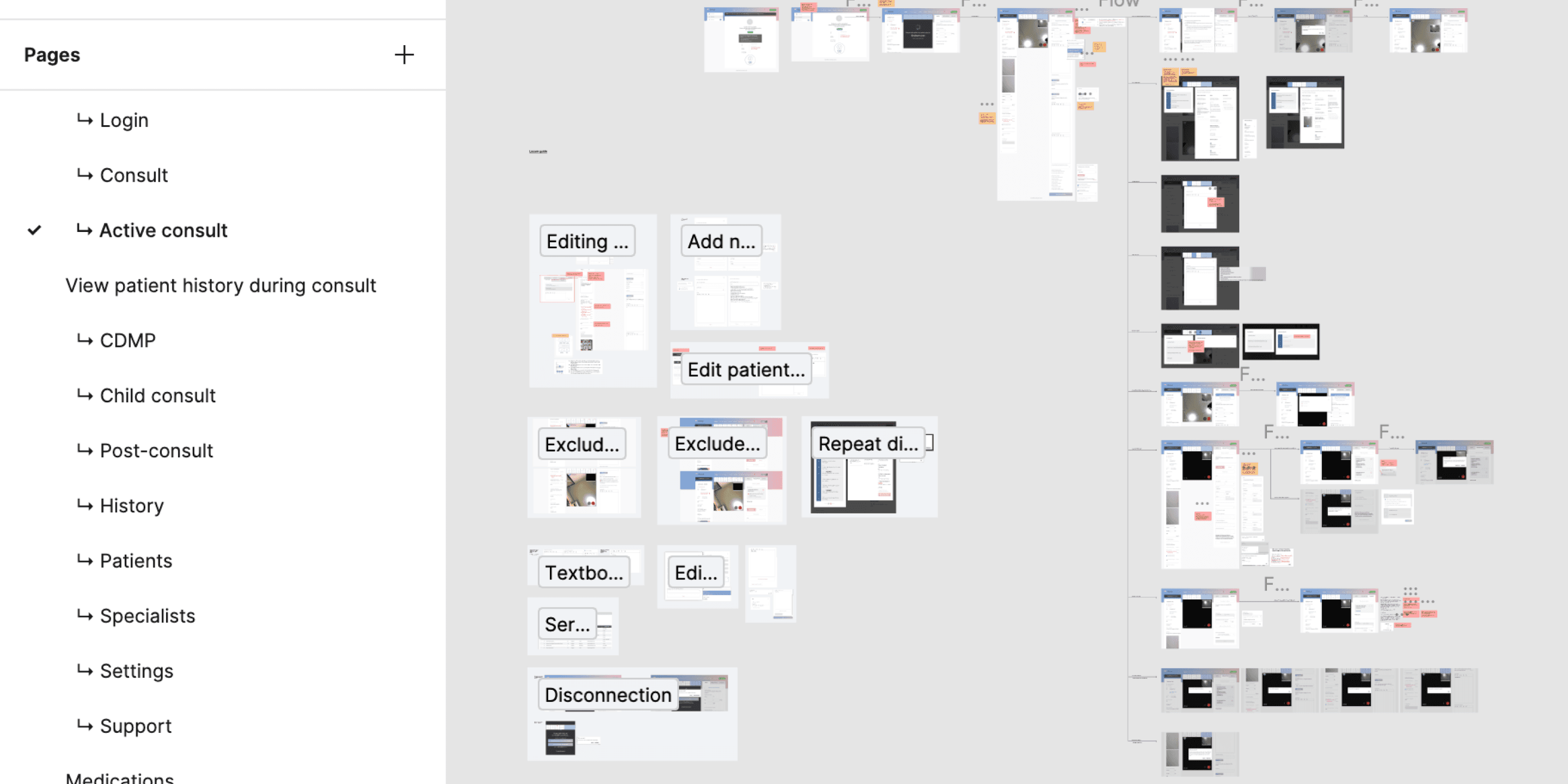
Full documentation of all user flows and screens.
Scroll below for details.
3 key design themes
Theme 1
Matching information hierarchy to a doctor's workflow and mental model
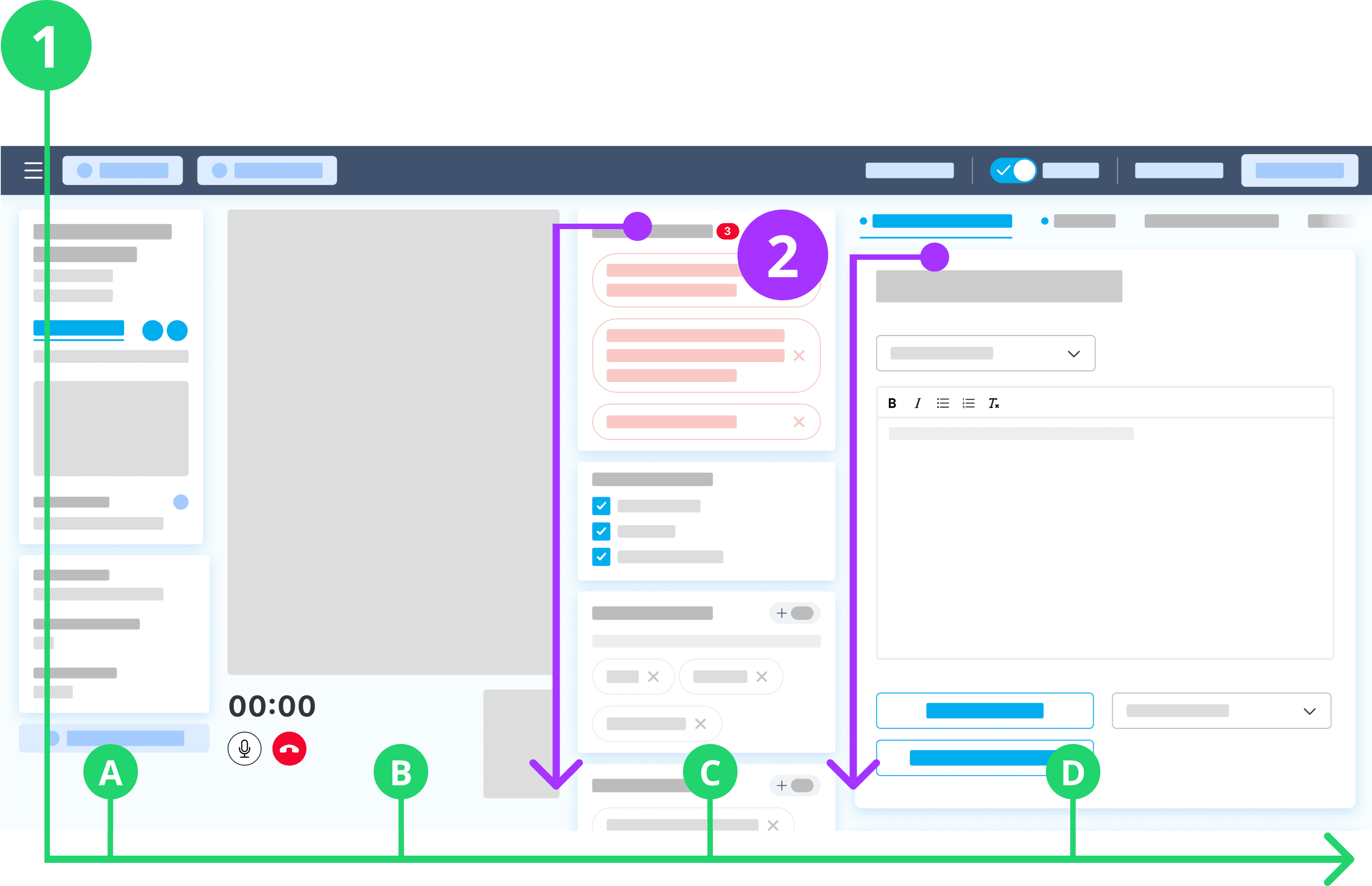
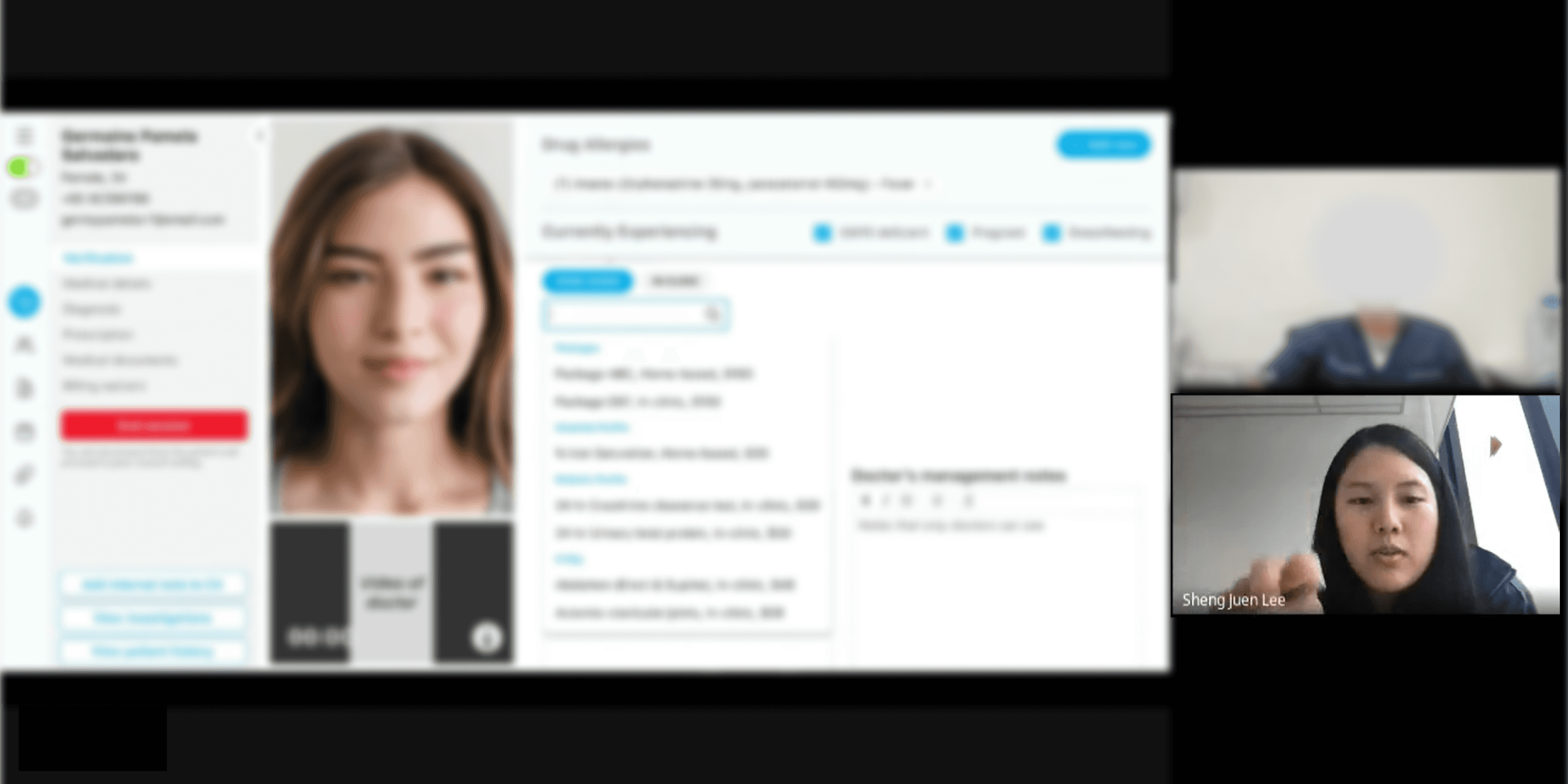
Doctors tended to work left to right across the screen through each consultation
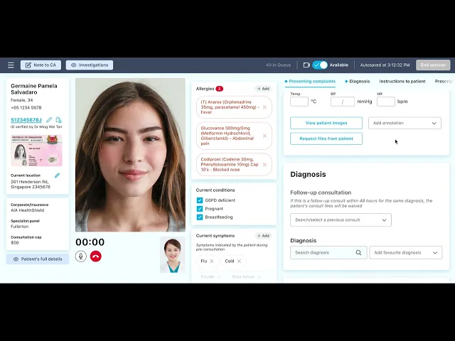
A consultation flow went in order of: (1A) Checking the patient's particulars, (1B) Verifying against a physical ID on video, (1C) Assessing the patient's medical history, and (1D) Diagnosing and recording consultation notes. The arrangement of 4 columns received positive sentiment for balancing workflow, screen space, and information groups.
Placing the video window at 1B was comfortable for two main reasons:
It was close to the webcam to mimic eye-contact from the patient's point of view.
Doctors could easily switch between examining the patient and taking notes.
Columns are independently scrollable for cross referencing of information
Columns 1C (Patient's medical history) and 1D (Consultation notes) are independently scrollable. This was crucial for doctors to reference important persistent information such as drug allergies and current medications—while taking consultation notes, prescribing medications, and writing care instructions.
Based on internal usage data and qualitative findings, medical information were grouped and arranged from most important and frequently used to least frequently used.
Theme 2
Quick multitasking between consulting and note-taking
Slide-up tab was effective at aiding doctors multitask between referencing information and taking notes
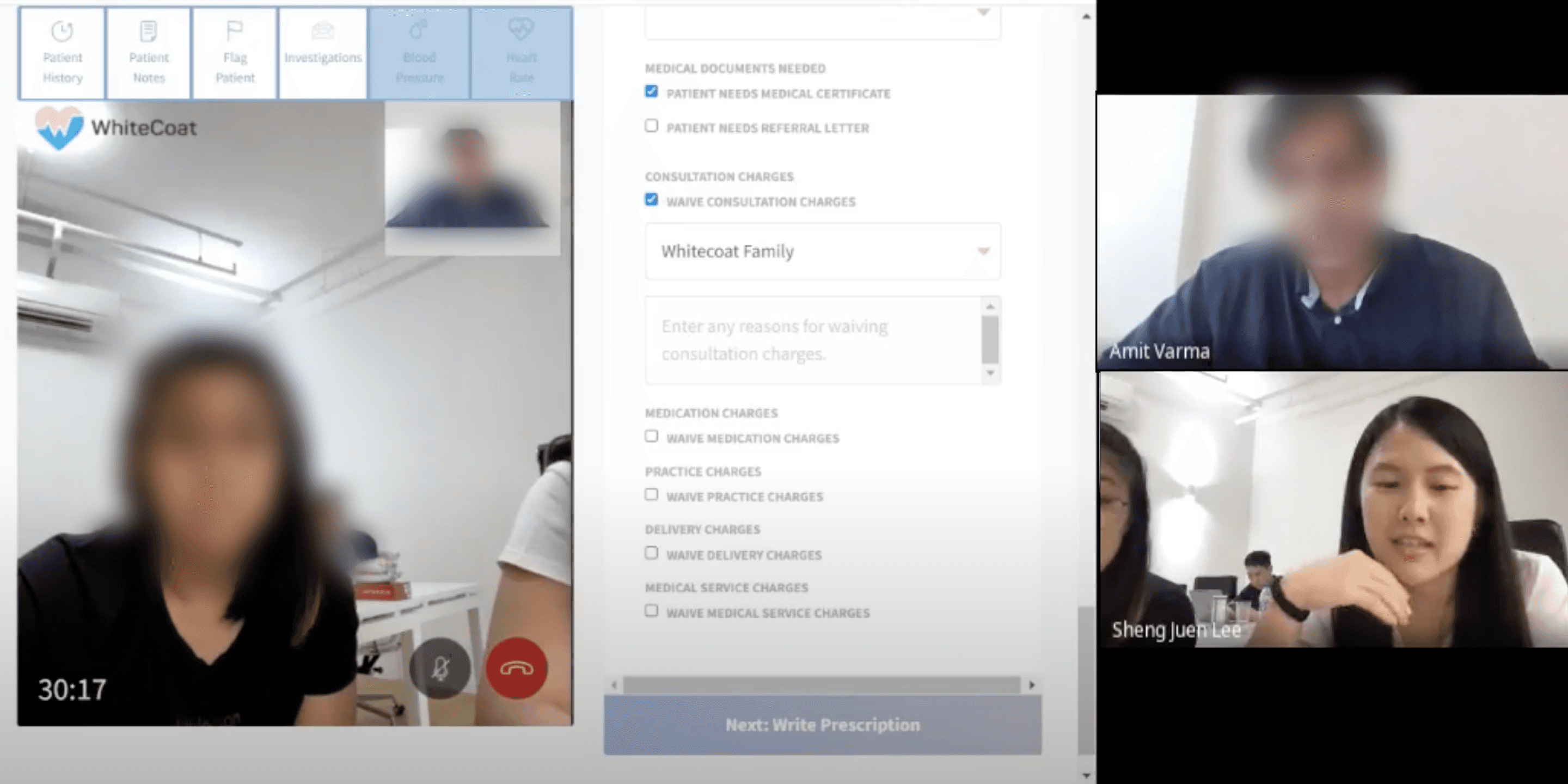
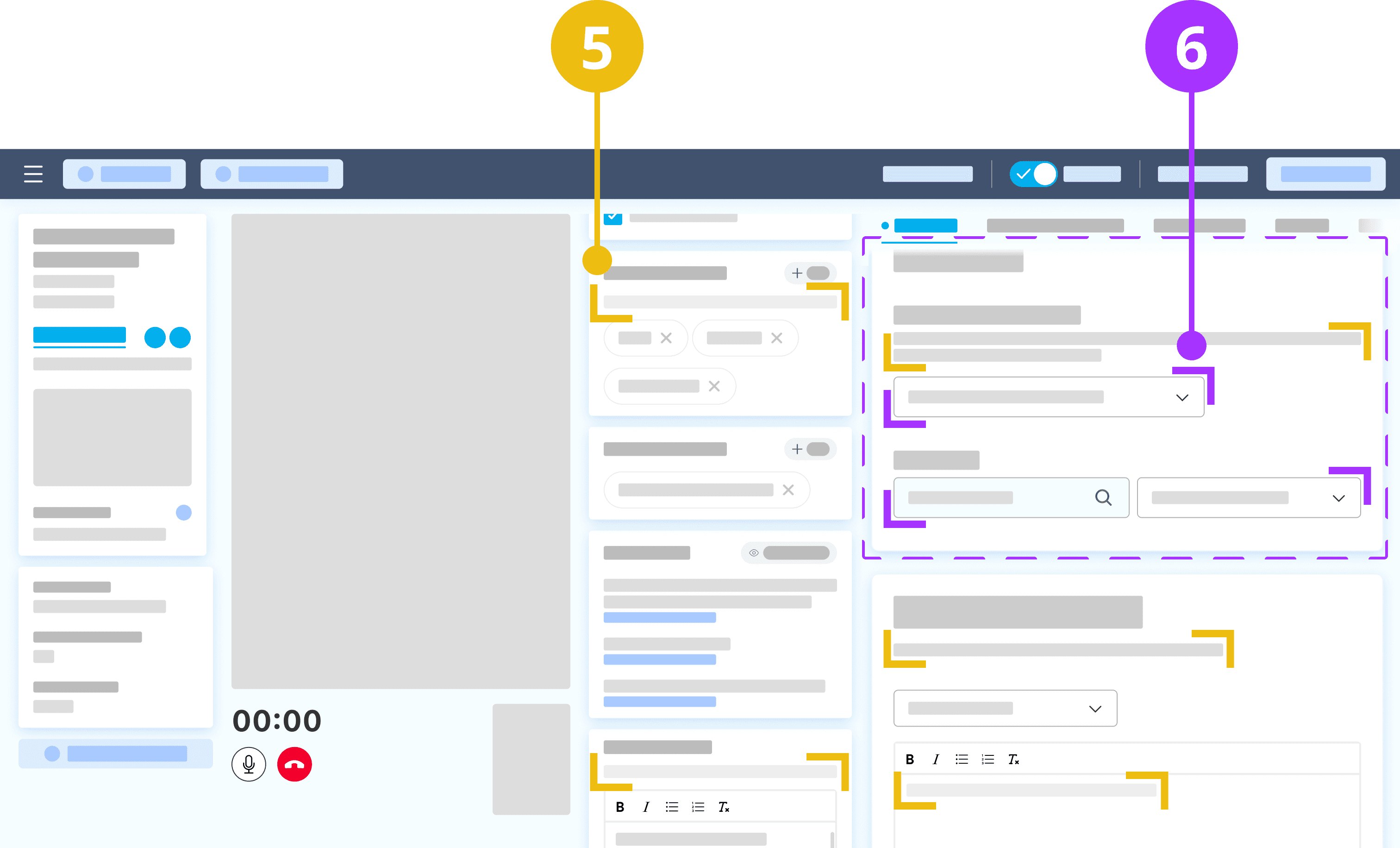
Overtime, a patient's medical file accumulates a lot of information—which doctors frequently refer to during a consultation.
To cope with this ever-growing amount of data, usability testing found this slide-up tab design on the left of the screen the most effective at aiding doctors multitask between referencing extra information whilst still taking notes and prescribing care.
Including a secondary navigation at the top allowed users to quickly move across sections within the column
The fourth column is where a doctor takes down consultation notes, writes instructions to patients, constructs the patient's diagnosis, prescribe medication, writing an MC, and essentially every action item related to the current consultation. Sometimes in this sequence and other times not, and also habits varying between doctors.
The design in this column needed a balance between:Sufficient visual breathing space between groups of information, and
Moving through the section without scrolling fatigue
Theme 3
Although screen real estate is limited, users should be able to pick up on the different available features intuitively
Relevant labelling and descriptions of features
While there is standard terminology for common medical information such as 'Diagnosis' and 'Presenting complaints' that do no require explanation for doctors, there are certain categories of information that have a generic and vague definition. For example, 'Patient notes', 'Patient summary', and 'Management notes' were interpreted and used differently during contextual inquiry.
Doctors also have many experiences other digital medical systems that inconsistently use such terms. For more ambiguous titles, adding straightforward and concise help text allows doctors to quickly recall their purpose and keep usage across doctors consistent. This is very beneficial for clean and transferrable data.
Including a secondary navigation at the top allowed users to quickly move across sections within the column
As described earlier, there are many actions a doctors needs to perform whilst consulting with a patient. When doing so online, doctors have the added complexity of delivering a smooth tele-consultation but multitasking behind the screen.
With such a heavy cognitive load, it was important to place information and action items within their appropriate context, where through usability testing, users demonstrated how they connected different groups of tasks.