2022
Doctors’ Dashboard
Web desktop, full research-to-design project
Project overview
Timeline
3 months
My roles
Planning and structuring of the design system
Creation and testing of components
Content documentation
The problem
We did not have an existing design system or component library. When I first joined, my UX lead was the sole UX person — and at the time could manage by keeping track of things on her own. With plans to grow the team and design processes, we needed to build a design system as part of the foundation to team collaboration.
Objectives
The goal was to create a design system that could:
Enable consistent design standards while being flexible enough for innovation.
Speed up design, testing, and development with components and templates.
Improve usability of app and web flows.
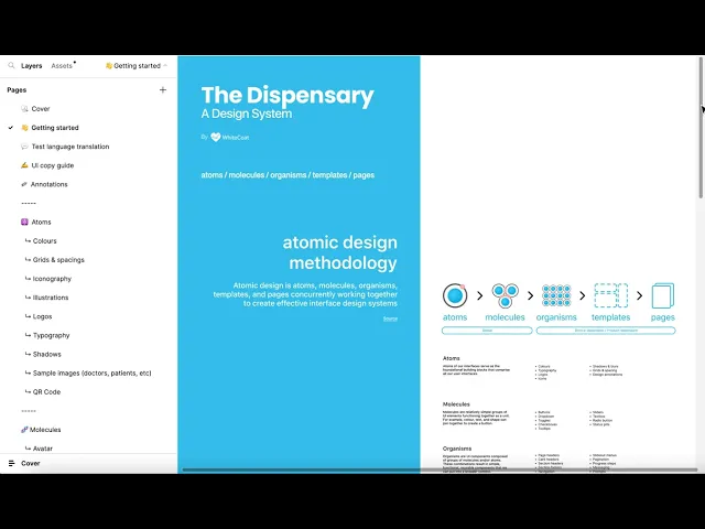
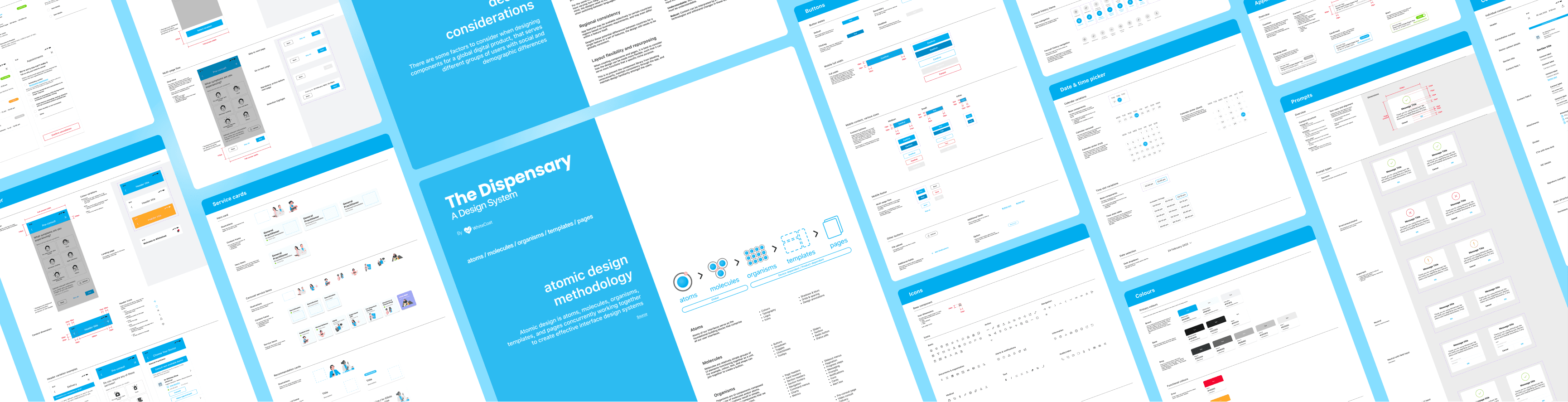
Building the design system
The Dispensary Design System
3 key factors in building the design system
Factor 1
Scalable building blocks
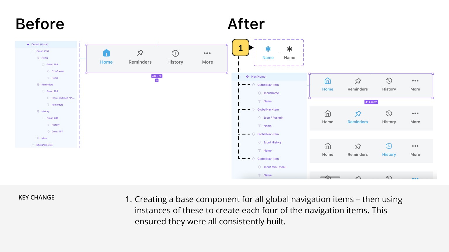
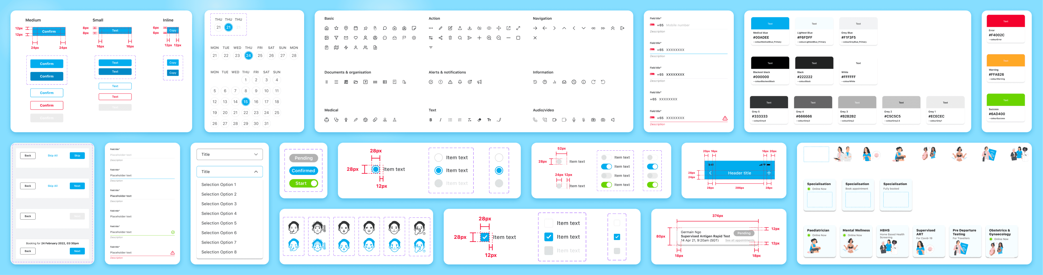
When creating components and pages, we considered how every component and design could be made more flexible, such that it can serve more functions than a specific niche purpose. This is to prevent the component library from bloating unnecessarily, maintain consistency through the app, and maintain design familiarity amongst the users.
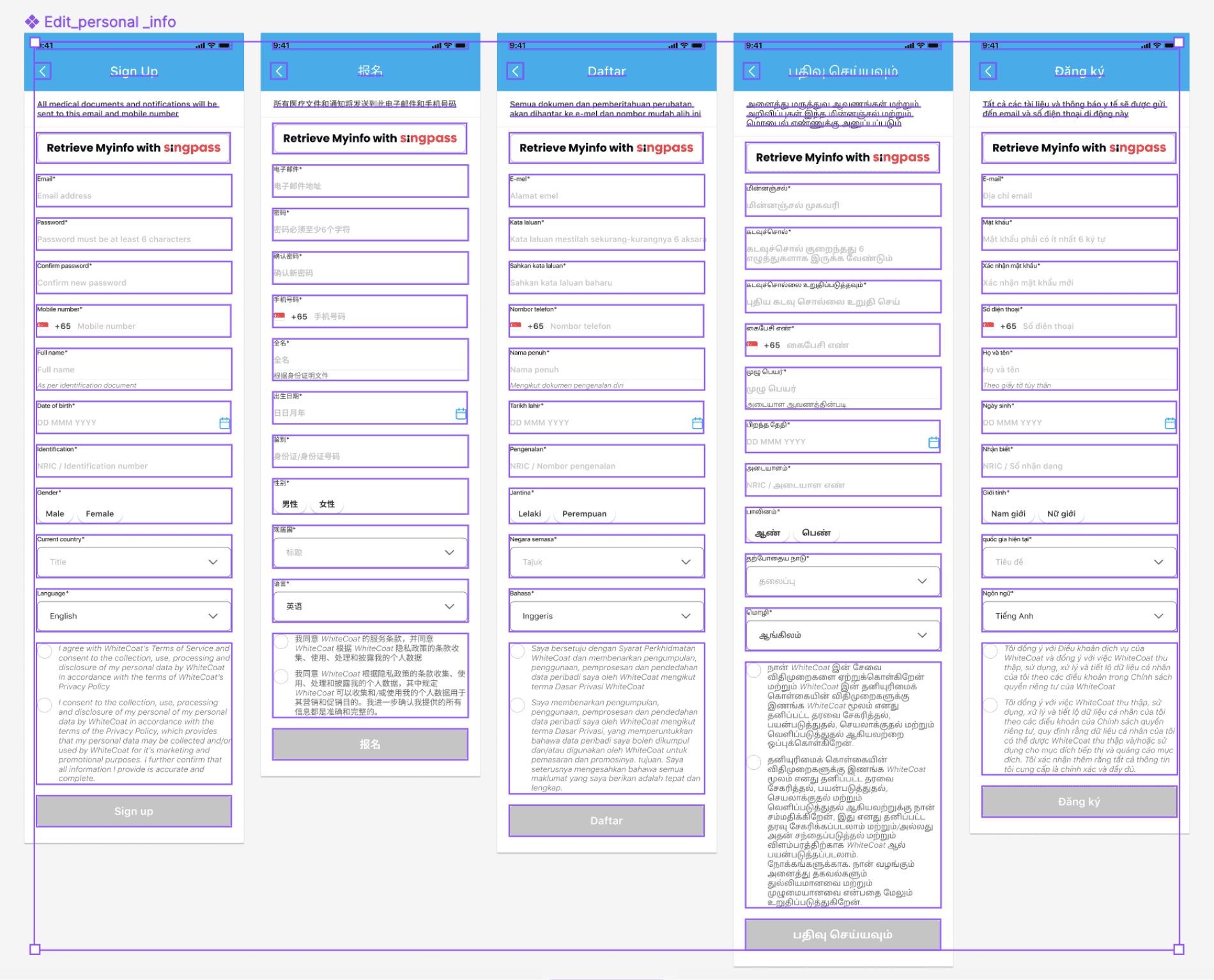
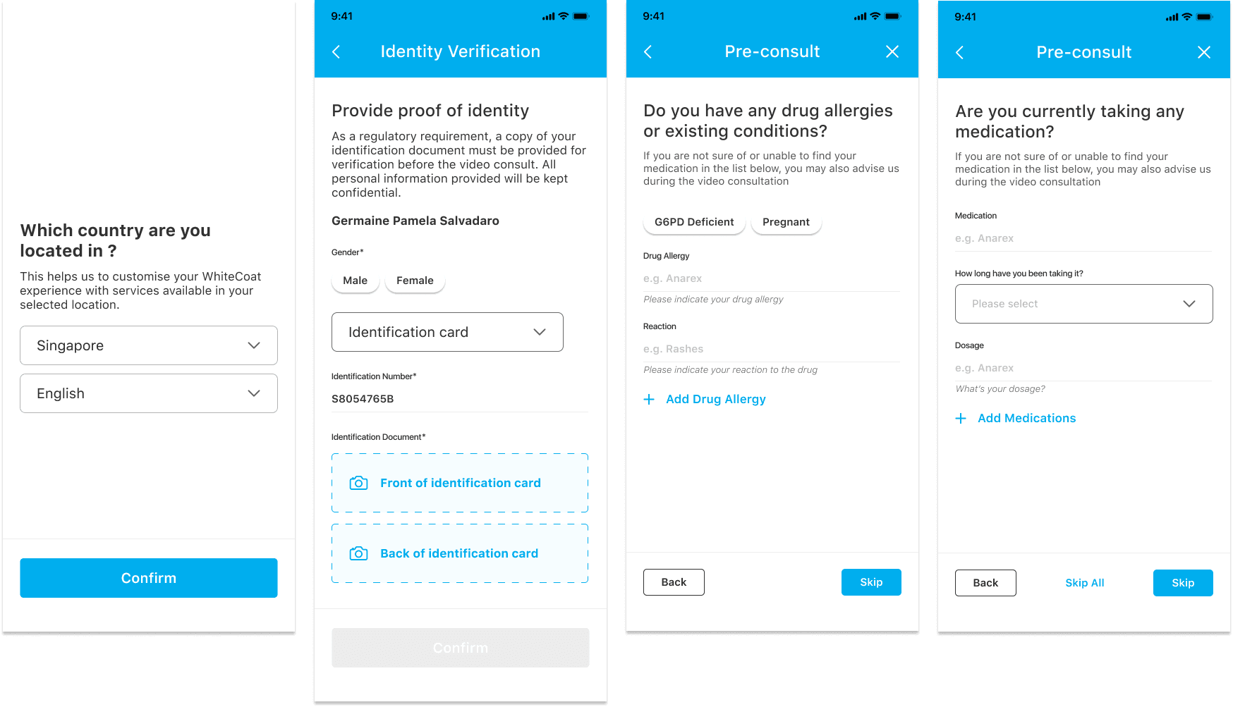
The images below demonstrate how different form pages can be created by reusing text field variations:
Factor 2
Component labels
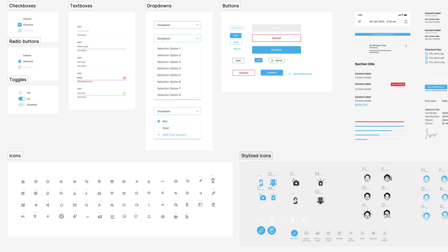
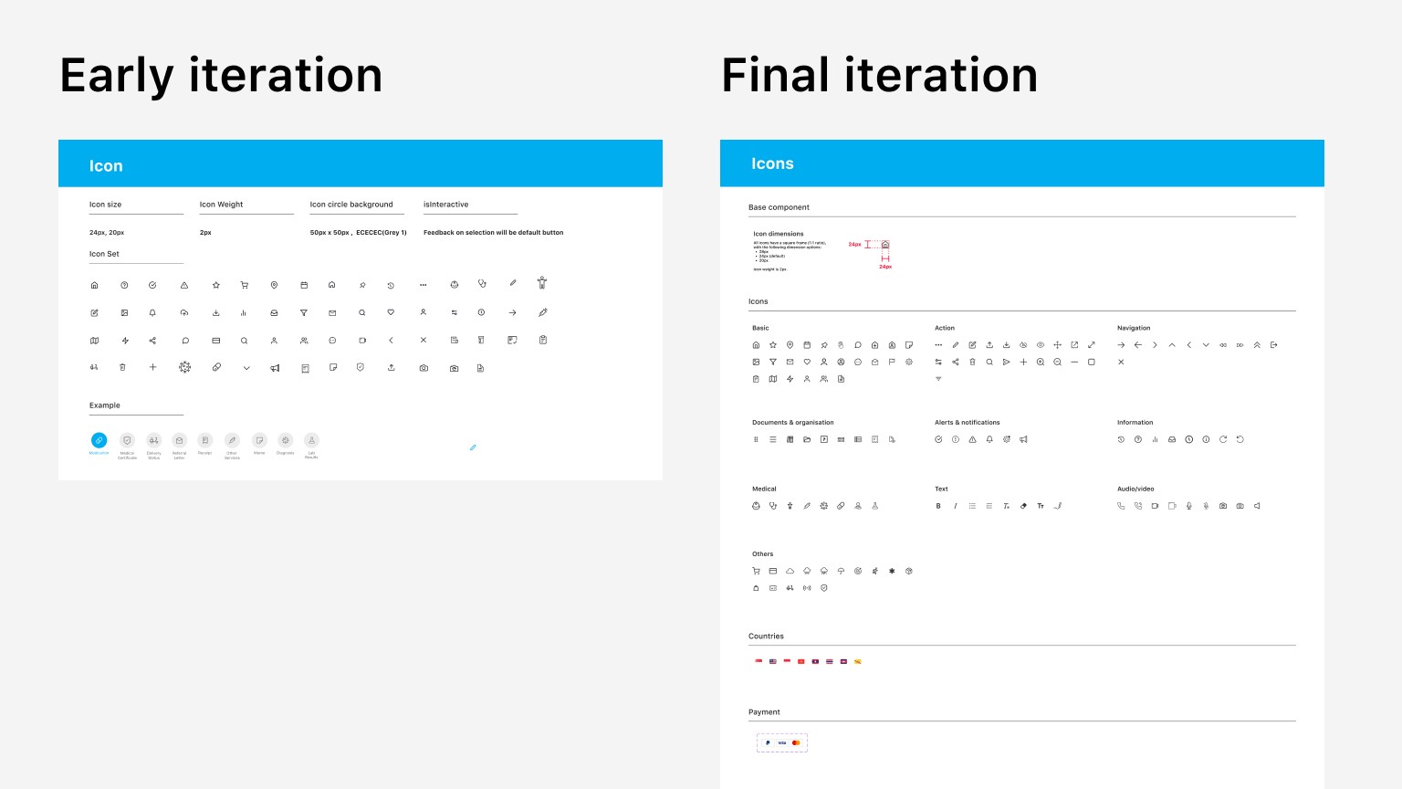
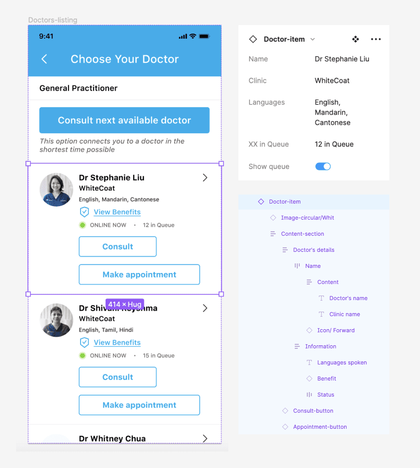
Accurate labelling helps with understanding what's in a respective component and how to manipulate its variables. It also makes it easy for non-Figma experts to edit components for mockups and presentation decks. This is made even more convenient with the 'properties' feature in Figma.
The image below shows how you can change the variables of a component in a page:
Factor 3
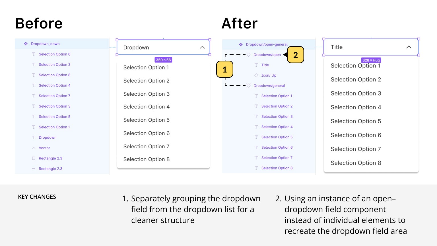
Designing for flexibility
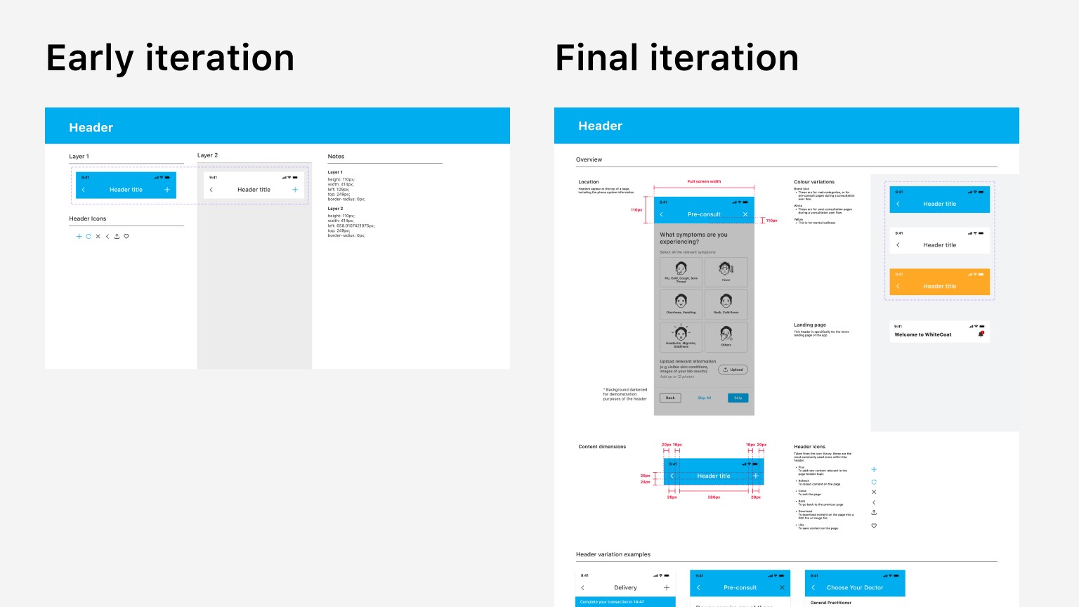
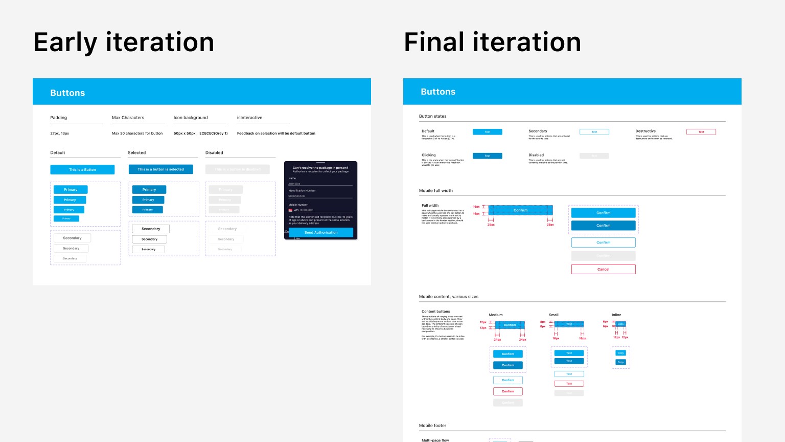
The key features that enable this in Figma include auto-layout, constraints, and frames.
Applying an auto layout to a frame's content automatically organises the content within it following consistent spacing and margins. This helps organise content on a page within the bounds of the frame, and that there is equal, adequate spacing between page components. Features like these are especially useful for structured pages like forms and directories.
The image below demonstrates how these features make previewing language translation easy using the same design. All the fields within are arranged with a consistent margin, and the page can automatically expand vertically for scripture that take up more vertical space.